The Ofuma Dashboard: What Those Three Numbers Actually Mean
Almost no dashboard tells you how its numbers were worked out, which is when it starts lying politely. What Total Prompts, Active Prompts and This Month really count.
By Dumebi ·
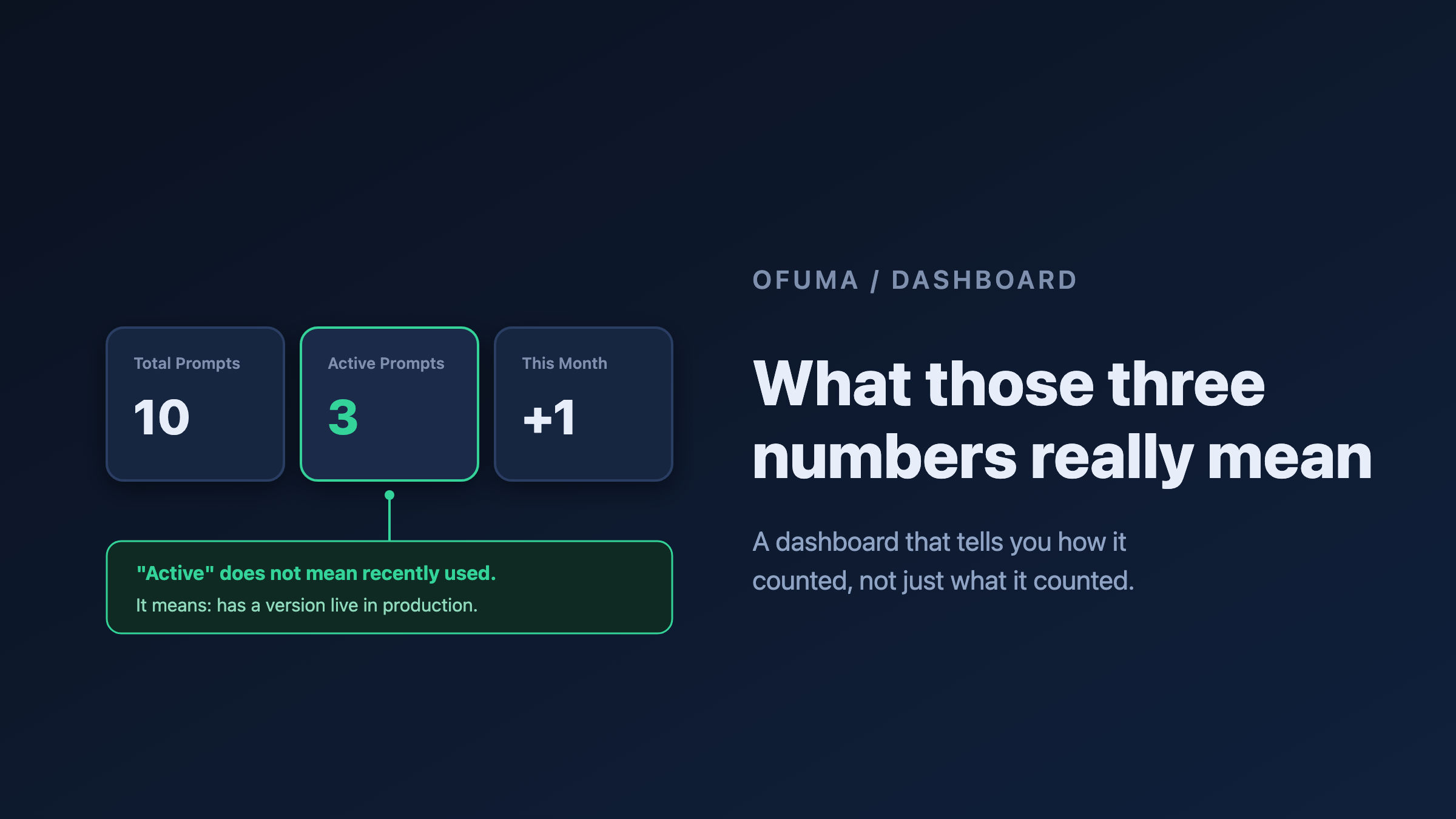
There is a particular kind of dishonesty that dashboards specialise in, and it is not lying. It is being vague in a confident font.
A tile says Active Prompts: 3. You nod. Of course. Three active prompts. Then someone asks you what "active" means and you realise you have no idea. Does it mean three prompts ran today? Three prompts are switched on? Three prompts have been touched this week? You have been reading that number for a month and quietly making decisions with it, and you never once knew what it counted.
I have written before about not trusting the dashboard, so it would be a bit rich of me to build one and then leave you guessing. This article is the opposite of vague: it is exactly what each number on the Ofuma dashboard is counting, in plain English, plus what the rest of the page is for.
It is the shortest article in this series, because the dashboard is the smallest room in the house. But it is the room you walk into first. 🚪
What the page is for
The dashboard is the front door. It answers three questions in the time it takes to glance: how much stuff do I have, what can I do next, and what happened recently. It does not try to be Observability (that is a whole separate room with real charts) and it does not try to be Activity. It is a landing pad.
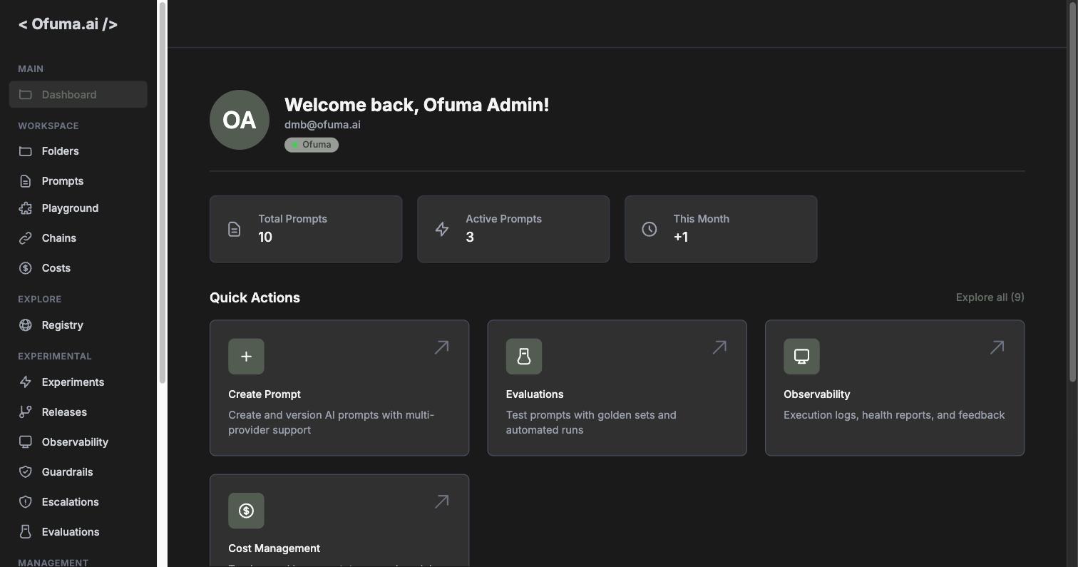
Everything on it is scoped to your currently active team. Not your org, not your account: the team. If you switch teams somewhere else in the app, the dashboard notices and refetches by itself. So if the numbers ever look wrong, the first question is not "is it broken" but "which team am I in right now?" The little green pill under your name tells you the organisation you are in.
The three tiles, precisely
Here is the whole point of this article. Three tiles, and each one counts something more specific than its label suggests.
Total Prompts
The honest one. It counts every prompt belonging to your active team. No time window, no filter, no cleverness. Delete a prompt and it drops. That is it.
Active Prompts
This is the tile people misread, and my example above was not hypothetical.
Active does not mean recently used. It does not mean "switched on", and there is no isActive flag anywhere behind it. Active Prompts counts the prompts that have at least one version currently deployed to the production environment.
That is a genuinely different question. A prompt that ran ten thousand times last month but only ever lived in development is not active. A prompt that was promoted to production a year ago and has never been called since is active. The tile is not measuring traffic. It is measuring deployment.
Once you know that, the number becomes useful in a way it was not before. Total 10, Active 3 does not mean "we only use three of our prompts." It means seven of your ten prompts have never been promoted to production. Those seven are drafts, experiments, and things somebody started and left. That is a much more interesting sentence, and it is a to-do list rather than a vanity metric.
There is a rule underneath this that I will get to properly in the Prompt article: promoting a version to production demotes every other version of that prompt, so there is exactly one production version at a time. Active Prompts is simply counting the prompts that have one.
This Month
Counts prompts created since the first day of the current calendar month.
Two things worth pinning down. It is created, not updated, so editing a prompt into a brand new version does not move it. And it is the calendar month, not a rolling thirty days. On the 1st, this number resets to zero no matter how busy you were yesterday. That is a design choice, not a bug: it answers "what have we started this month," which is a question with a natural boundary. But it does mean a quiet 1st of the month is not a signal of anything. The + in front of it (+1) is a hint that this is a count of new things, not a total.
While the numbers load you see a dash rather than a zero, which is a small mercy. A zero that turns out to be a loading state has started more than one panic in this industry.
Quick Actions, and the hidden five
Four cards sit under the tiles: Create Prompt, Evaluations, Observability, Cost Management. Then there is an Explore all (9) link on the right, which is doing more work than it looks like.
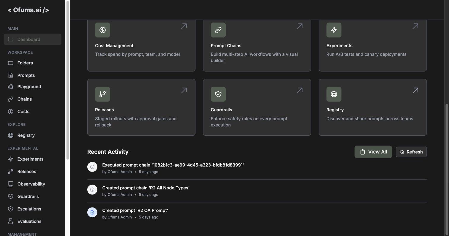
Clicking it reveals five more: Prompt Chains, Experiments, Releases, Guardrails, Registry. The link flips to "Show less."
The nine are worth reading as a set, because they are a better map of the product than the sidebar is. The sidebar is organised by where things live. This grid is organised by what you might want to do, and each card carries a one-line description of the feature's actual job:
Action | What it is for |
|---|---|
Create Prompt | Create and version AI prompts with multi-provider support |
Evaluations | Test prompts with golden sets and automated runs |
Observability | Execution logs, health reports, and feedback |
Cost Management | Track spend by prompt, team, and model |
Prompt Chains | Build multi-step AI workflows with a visual builder |
Experiments | Run A/B tests and canary deployments |
Releases | Staged rollouts with approval gates and rollback |
Guardrails | Enforce safety rules on every prompt execution |
Registry | Discover and share prompts across teams |
If you are new to Ofuma and want the two-minute version of what it does, that table is it. Everything else in this series is a longer answer to one of those nine lines.
One small detail: Create Prompt does not just take you to the prompts list. It goes to /prompts?create=true, so the create modal is already open when you land. A tiny thing that saves a click, and a nice example of a link carrying intent rather than just a destination.
Recent Activity
Below the grid sits the last three things that happened on your team.
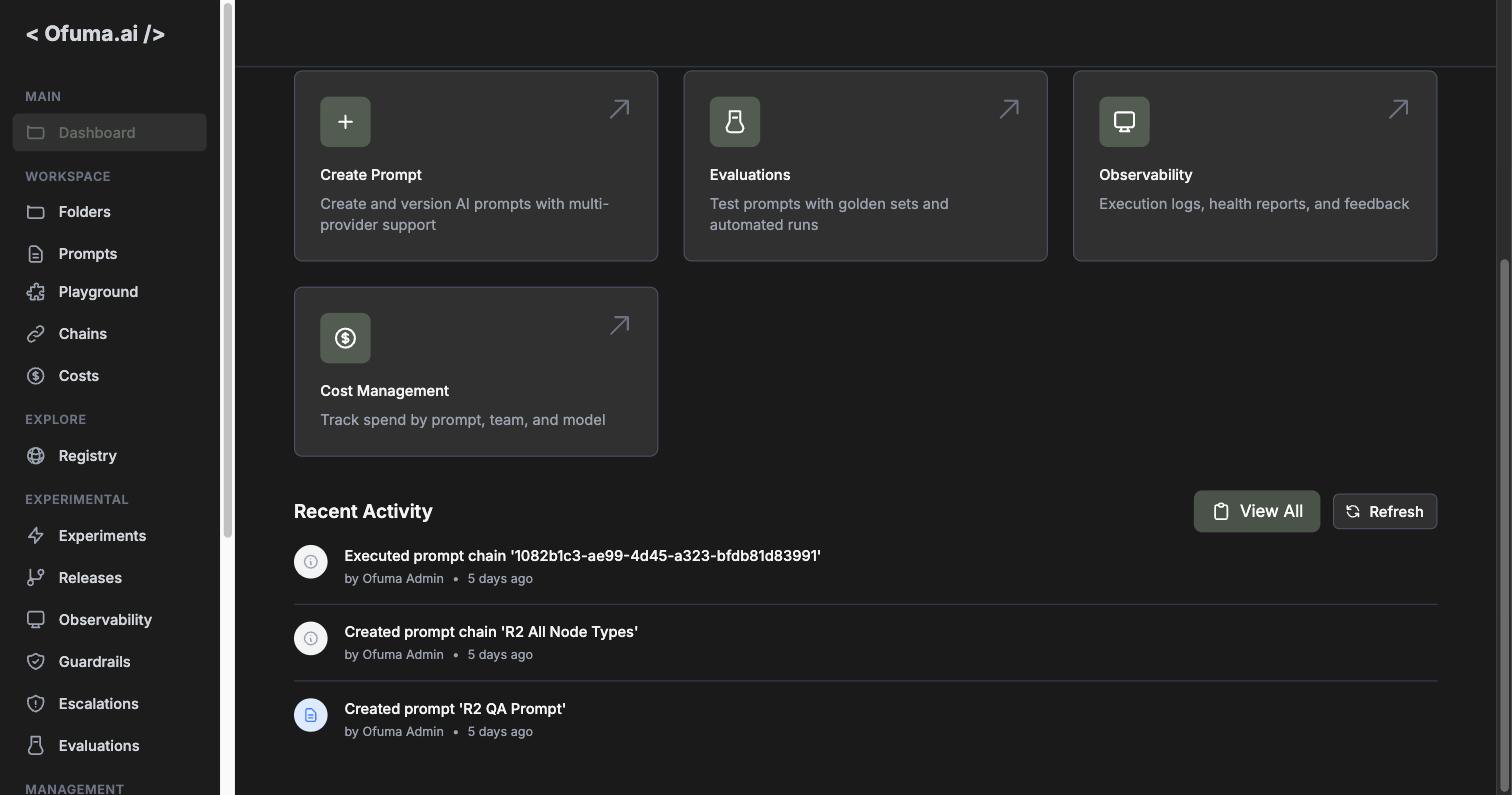
Each row gives you the event, who did it, and how long ago in human words: "Just now" under a minute, then minutes, then hours, then days, and once you pass a week it gives up on relative time and shows you an actual date. Sensible. "437 hours ago" helps nobody.
The icon and its colour change with the type of thing that happened, so prompts, chains and releases are visually distinct at a glance without reading a word.
Three is a deliberately small number. This is a teaser, not a log. View All takes you to the Activity page, which is the real audit trail and gets its own article. There is also a Refresh button, which disables itself while loading so you cannot spam it.
If nothing has happened yet, the section says so and offers you a button to create your first prompt rather than showing you an empty box and walking away.
The page that changes shape
Here is the nicest touch, and you will only ever see it once so you might miss it entirely.
There is a Getting Started section that only appears in two situations:
You have no organisation, in which case it offers you a Create Organization button
You have an organisation but zero prompts, in which case it offers you Create Your First Prompt
Once you have an org and at least one prompt, the section disappears forever. The dashboard stops being a tutorial and becomes a dashboard.
This is worth calling out because it is the correct answer to a problem every product has: the empty state. A brand new user and a user with 400 prompts need completely different pages. Rather than showing the newcomer a wall of zeros and hoping they figure it out, the page notices they are new and turns into a set of instructions. Then it gets out of the way. I like software that knows which conversation it is having. 🙂
The one thing it will not tell you
The dashboard deals in counts, and counts are shallow by design. Nothing here tells you whether any of it is any good. Ten prompts, three in production, one created this month: fine. Are they working? Are users happy? Is one of them quietly burning money or failing 14 percent of the time?
That is not a gap, it is a division of labour. Those questions belong to Observability, Costs, and Evaluations, and each of them is a much bigger room with much better instruments. The dashboard's job is to get you oriented and then hand you off, which is exactly what the nine quick actions are for.
So: glance, orient, click through. That is the whole contract. And now, unlike most dashboards you will meet today, you know exactly what its numbers mean, which means you know exactly when to believe them.
I hope you are still with me, because next we go to Folders, where those ten prompts stop being a flat pile and start being an actual filing system. 📁
Let all things be done decently and in order. - 1 Corinthians 14:40